LOGO DESIGN
Your brand’s logo is usually the first thing people will see, so it’s important that it communicates the right message and feel to your audience.
Whether you’re a new brand/company looking to have a logo created for the first time, or you’ve been in business for a while and need to rebrand and get a makeover, I will help you through the process to land on a logo that fits your vision.
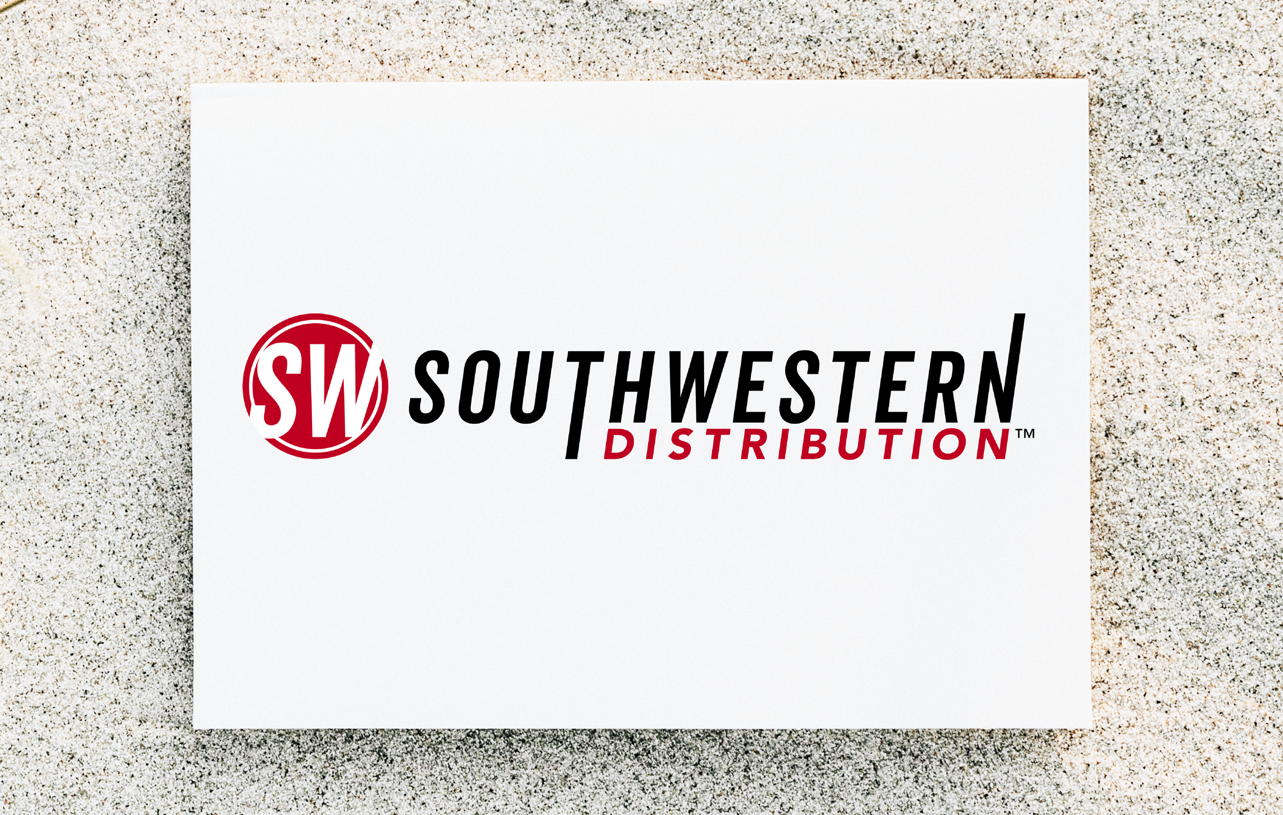
I designed the Southwestern Distribution logo to tie back to the mother brand, Southwestern Family of Companies, but also to have some unique standouts. The red was to signify action, energy, and passion. Southwestern Distribution is a strategic logistics and fulfillment center and they wanted people to know that they take their jobs seriously and do it with passion and with urgency. The logo icon has a white ring just within the outer border, symbolizing the success of safely holding and managing client's products within their care.
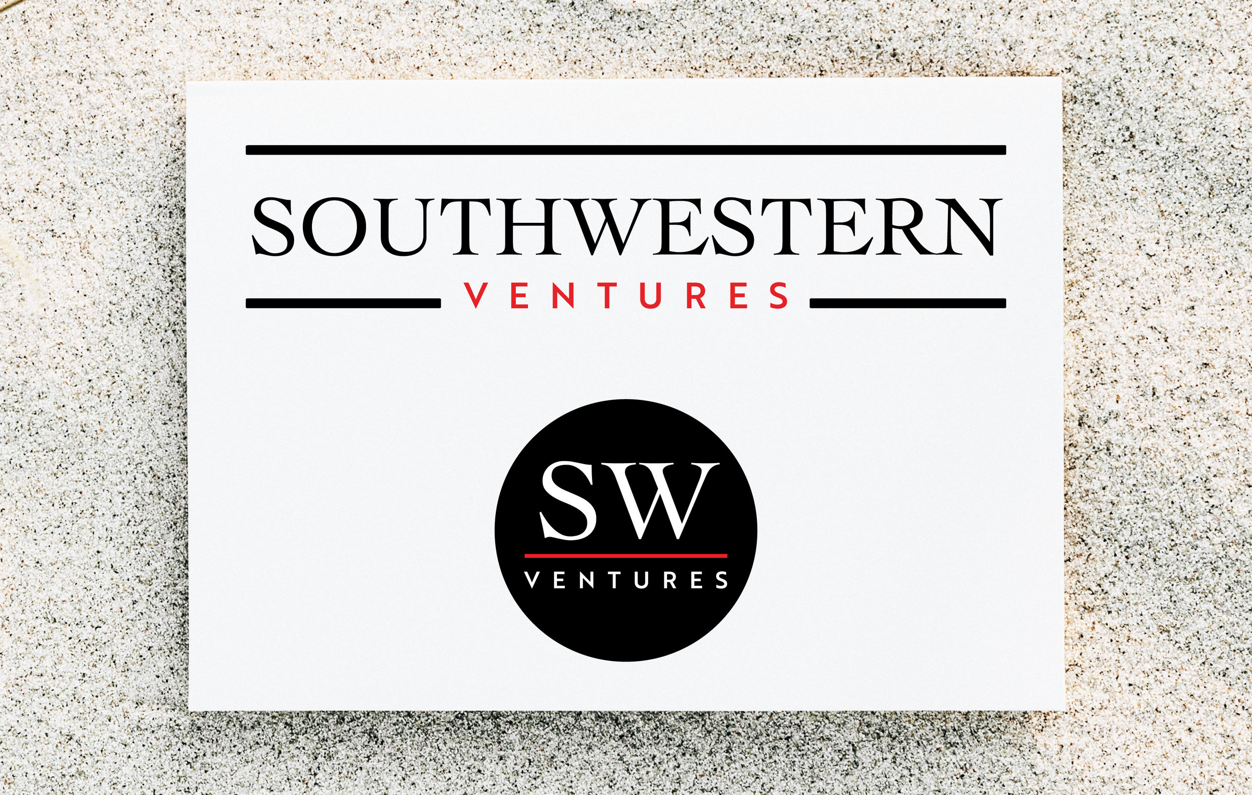
Southwestern Ventures is an international profit center founded to create career and entrepreneurial opportunities for young people in Europe (specifically Estonia, Latvia, Lithuania, and Poland). They wanted a strong, trustworthy, and professional look. The fonts are both classic and clean symbolizing wealth of knowledge yet modern to apply to today's market. I chose a subtler presence of red for their confidence without being overbearing or overwhelming.
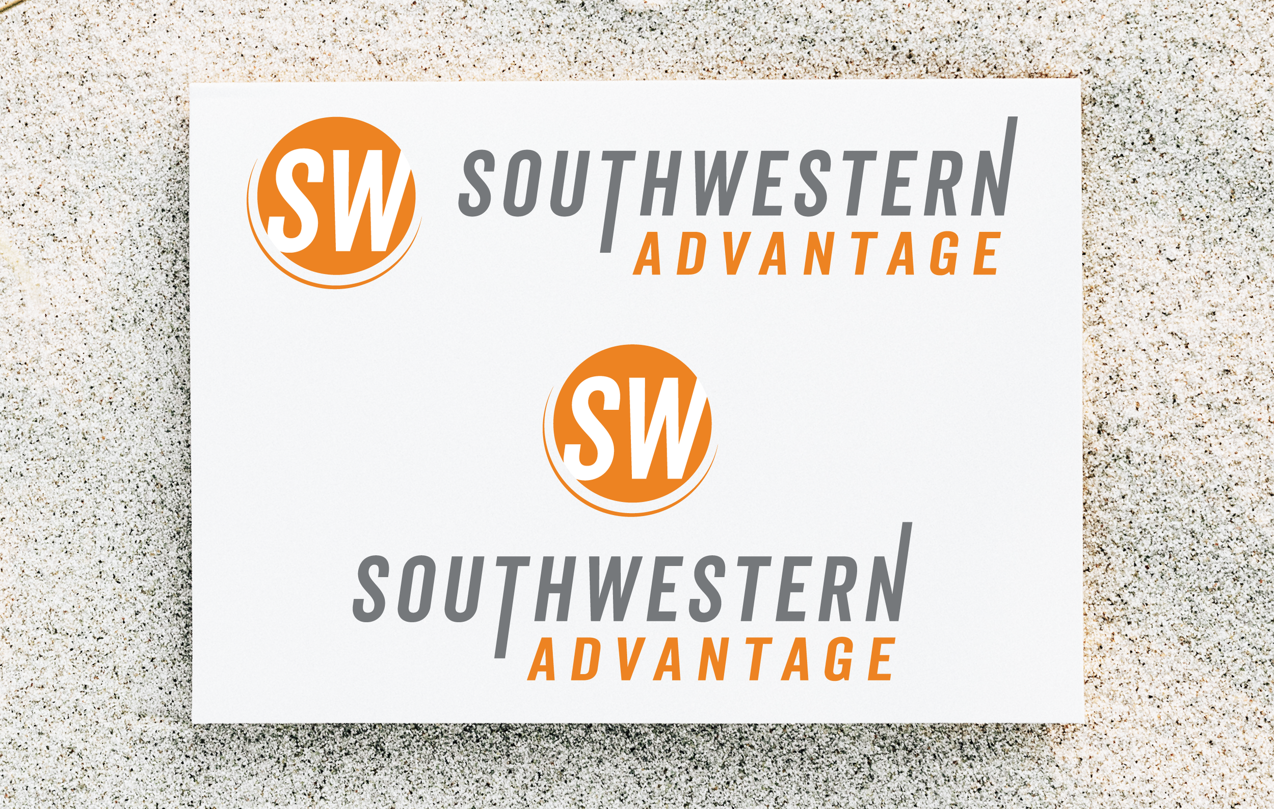
I designed a rebranded logo for Southwestern Advantage with "SOUTHWESTERN" style tying back to the mother brand, Southwestern Family of Companies, and also retaining the orange and gray color palette to symbolize a bold and exciting direction for the brand. The logo icon includes the addition of a tapered half circle stroke at the bottom left to symbolize being supported by the mother brand as it is among one of the oldest companies within its family of companies.
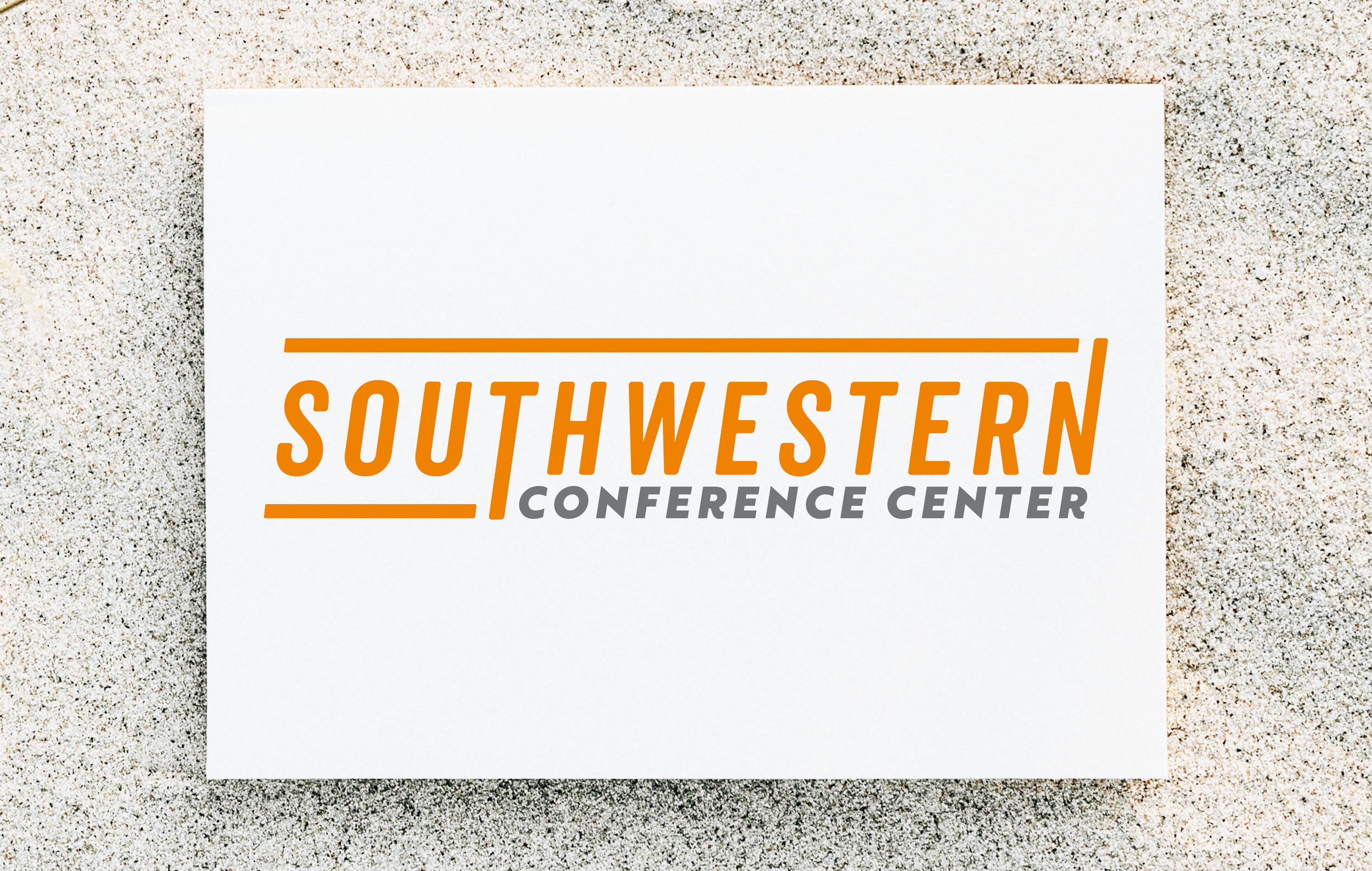
The Southwestern Conference Center is a versatile and comprehensive venue offering a wide range of services and amenities to create successful events for clients, sitting within the Southwestern Family of Companies (SWFC) headquarters. The logo is an almost complete tie-back to SWFC's brand as it is a venue within the company. Rather than the closed orange border that SWFC utilizes in their logo, I opened up the sides of the border to symbolize the space being open to outside clients rather than just being available for the company and its employees.
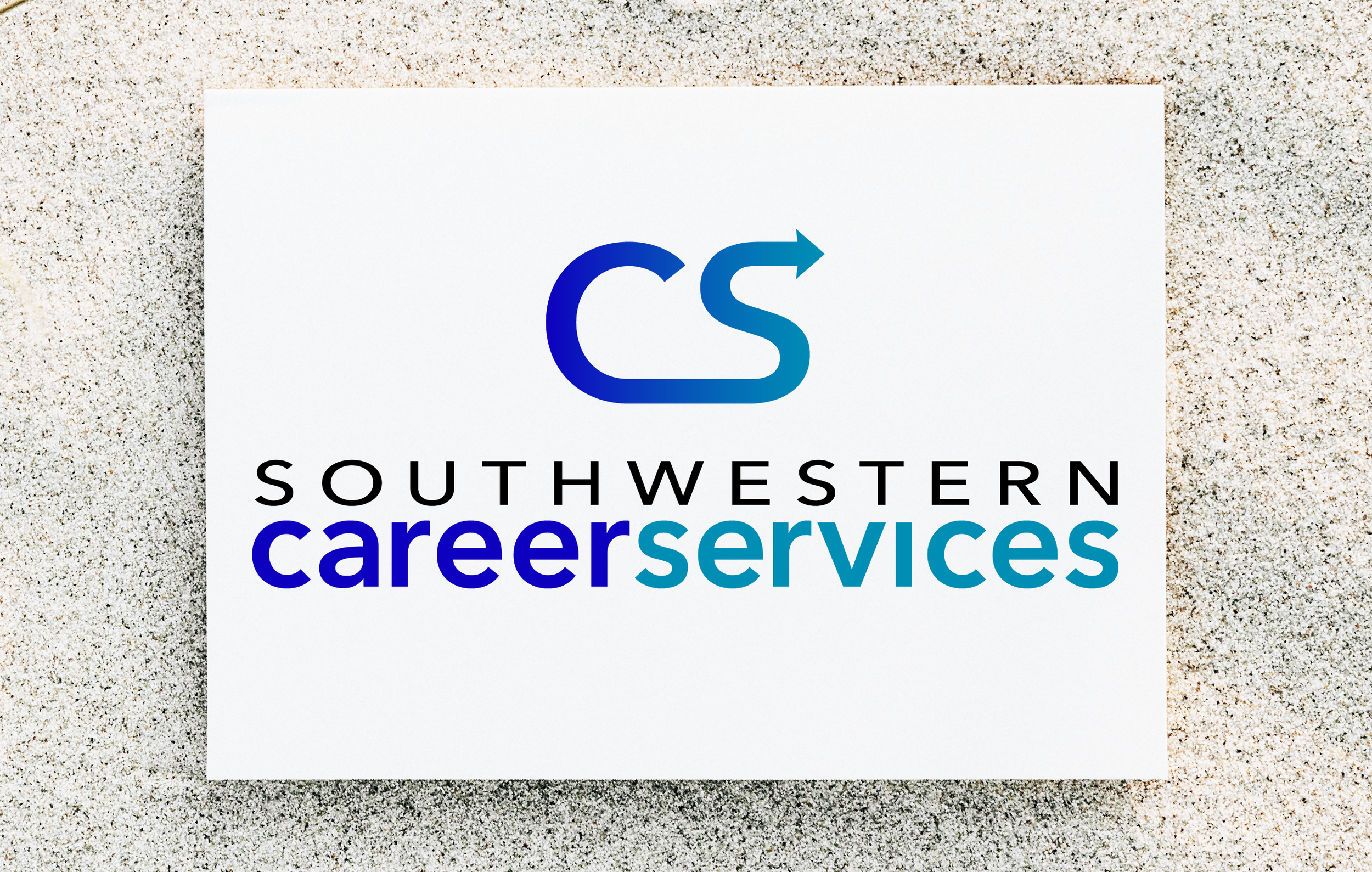
I created this logo for Southwestern Career Services. They wanted people to feel that they were approachable and trustworthy when coming to them to find a career placement, but also knowledgable in their space. I used a color palette that conveyed trust and safety in their hands and a font that was welcoming. I chose lowercase letters throughout careerservices to stress the feeling of approachability, that they were teammates in their career search. The absence of the space between the two words and using color to differentiate was to visualize the connectivity between them both. The logo icon was made to be continuous with an arrow pointing forward to symbolize the connection of the candidate's career with their services, and in working together they would move forward successfully.
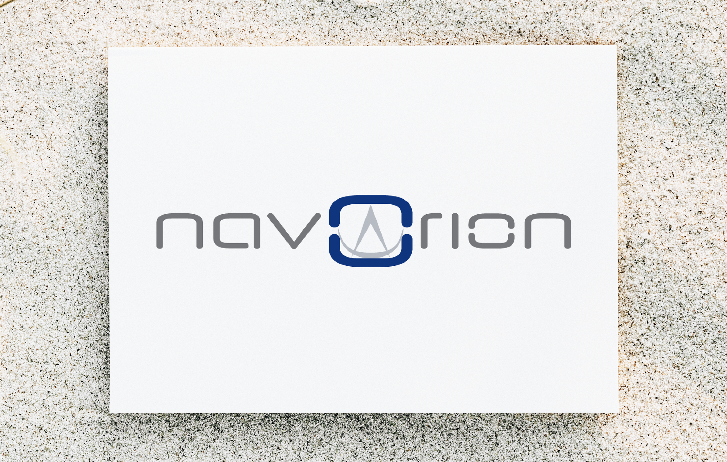
Logo creation for a new company startup called navOrion that is a match platform for employee candidates to companies that allows both the candidate and employee to seek the best fits (inspired by dating sites, but for professionals). Their desire was to have a logo based on a combination of 'navigate,' which corresponds with their vision of providing guidance and leadership, and 'Orion,' the large constellation symbolizing the hunter. They wanted a clean and crisp font. The original concept was to include three stars in the design, which they ended up not wanting after seeing it in application. To still capture the 'navigate' element, I created a sextant design within the 'O' to symbolize this. The 'O' with the sextant as a standalone is to be used as their logo icon.
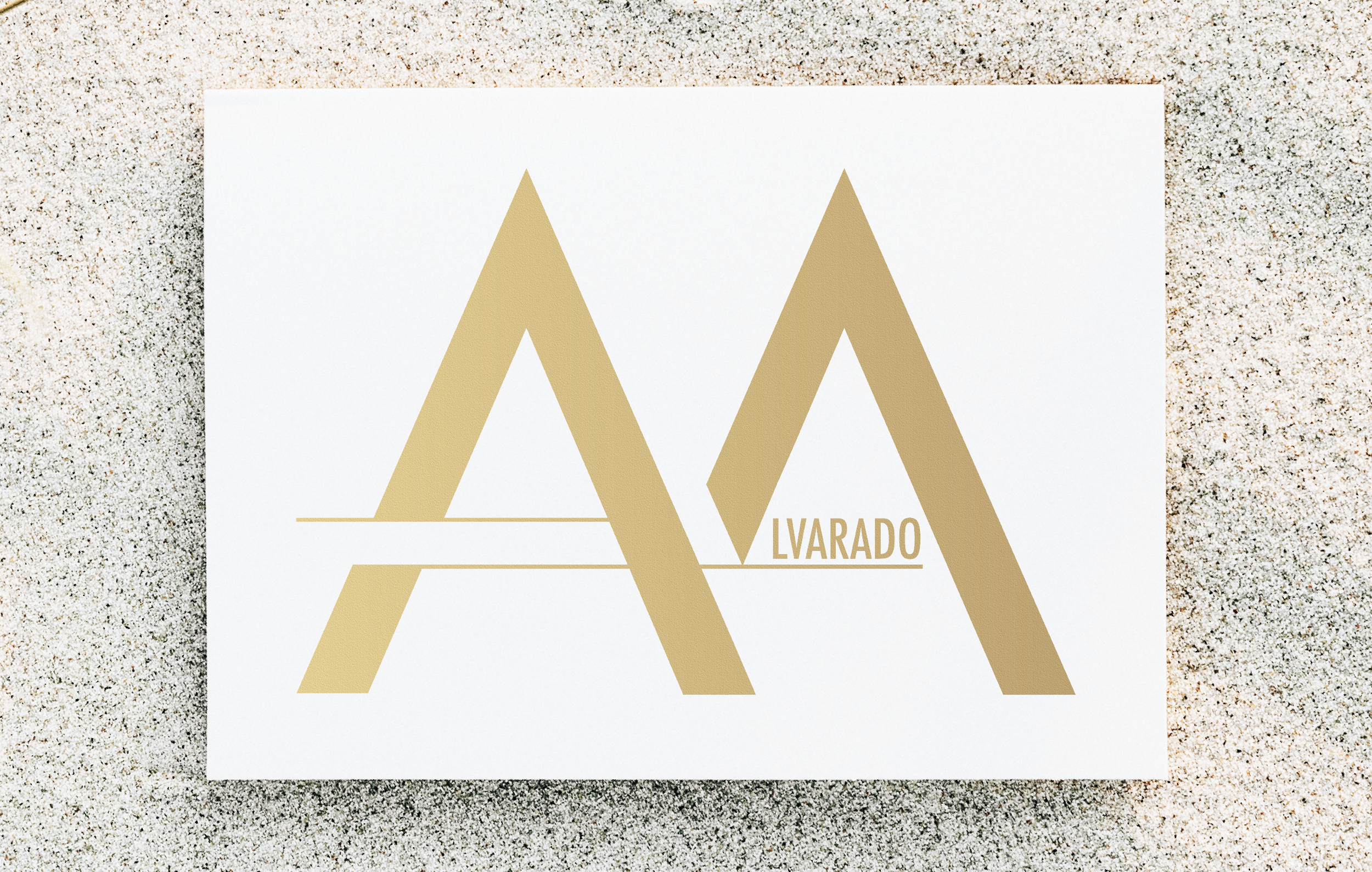
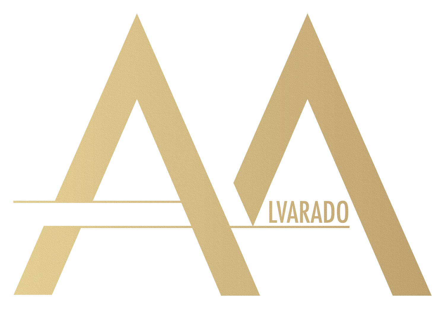
This is the logo I created for myself as an artist (both music and design). I wanted to give an uplifting feel, to emote inspiration, compassion, and confidence. To do this, I chose gold as the color for my logo. The gradient on it symbolizes not just a sense of quality, but also that although life constantly changes, the qualities still remain (hence why it's a gradient of different weights of gold).
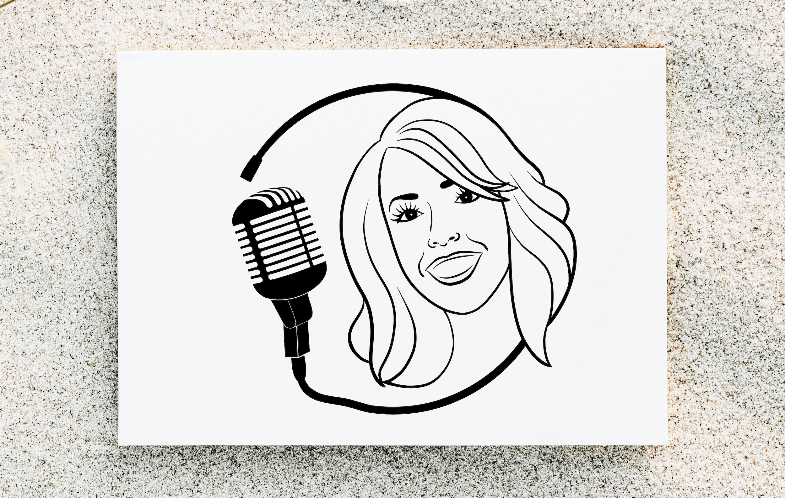
I created this logo for Citerin Voiceover to capture both her kindhearted and approachable personality, but also her profession. The microphone cord not being plugged into anything symbolizes her versatility and ability to not be locked down into just one style.
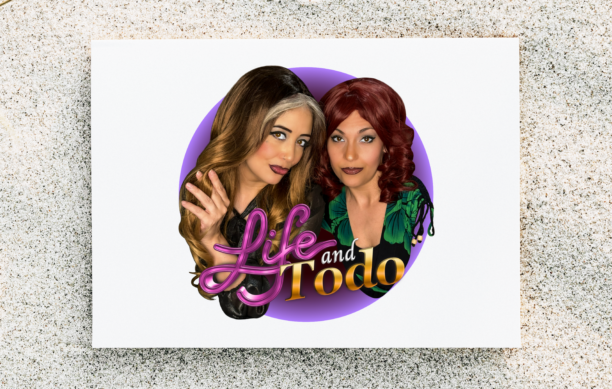
I am co-founder of a Spanglish comedy video web series. I created this logo to capture our comedic essence and throwback to the telenovela style.
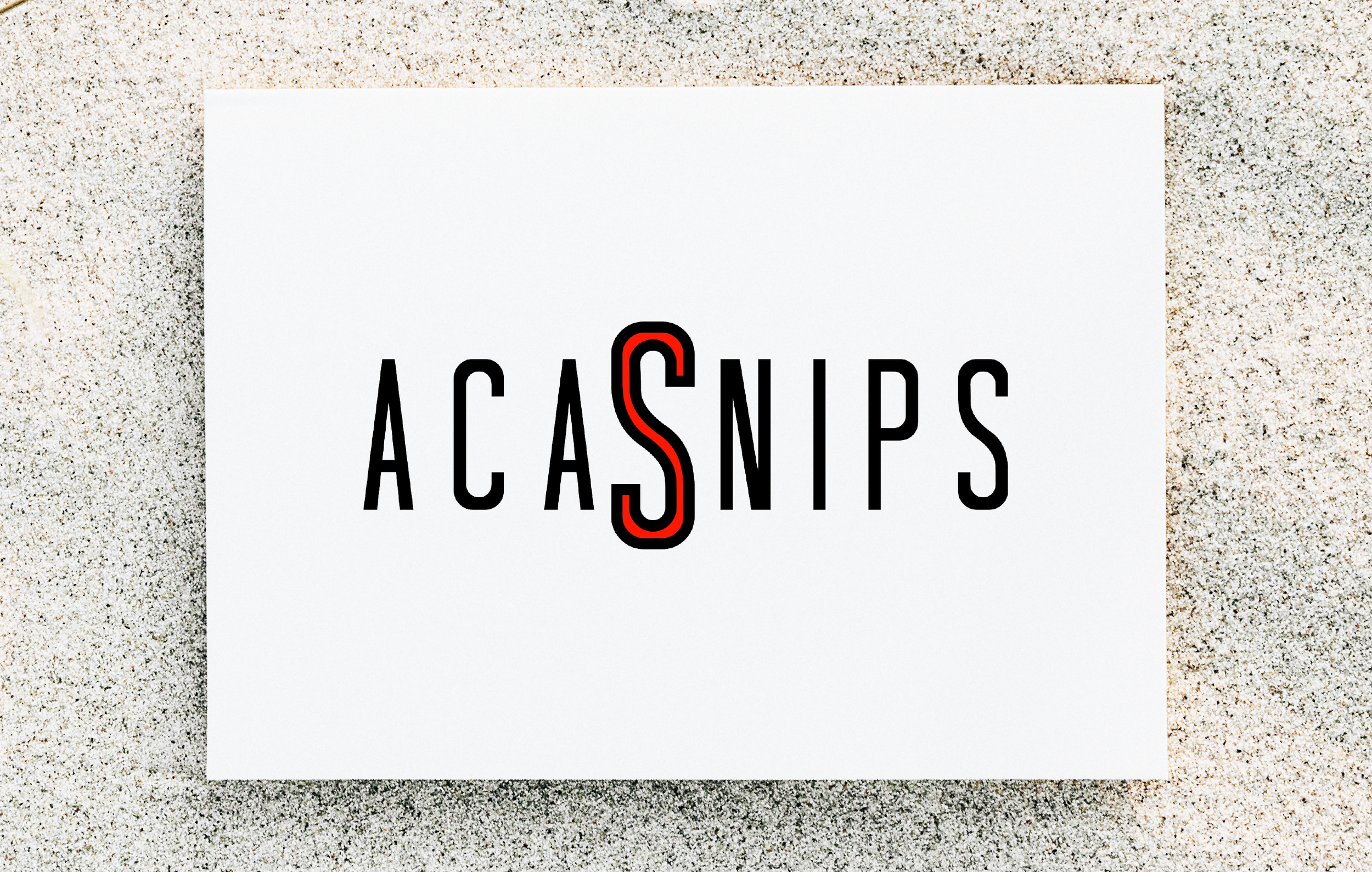
I designed this logo to promote a social media series of Acapella Snippets, posting my own videos and then encouraging others to share theirs as well to build community and connection.
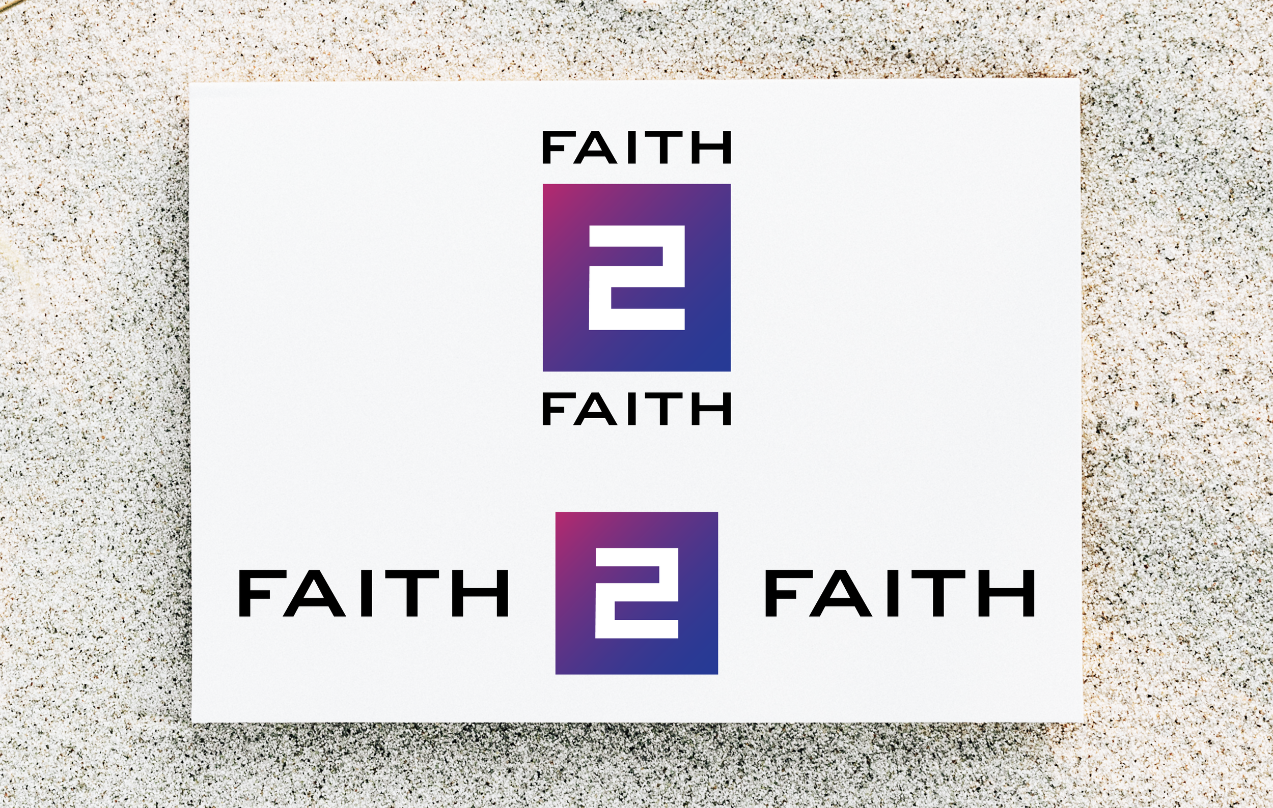
Logo creation for a music ministry called Faith to Faith. The group name is based on Romans 1:17 "For therein is the righteousness of God revealed from faith to faith, as it is written, the just shall live by faith." The logo icon captures this by having the two F's flipped and connected to reveal the 2 within, symbolizing the revealing from faith to faith.
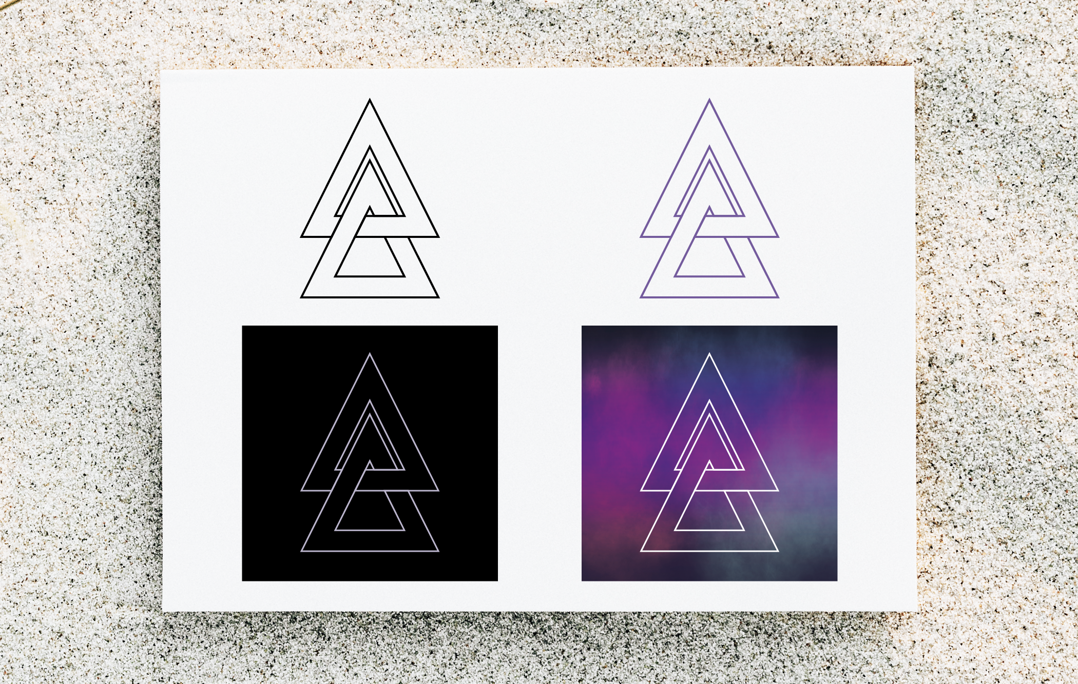
I designed a logo mark as a rebrand for the band Arcane Atlas for their new album release, as well as an album cover/booklet (included in the Album/Cover Art & Designs page). The band's name Arcane Atlas is a play on words, meaning, "The world (Atlas) known by few (Arcane)." In creating this logo mark, I linked the two A's from the band's font showing a close connection, symbolizing "known by few."